More than a loan
The experience needed to make room for savings and future financial products.
CASE STUDY 01 · FINTECH · MOBILE APP REDESIGN
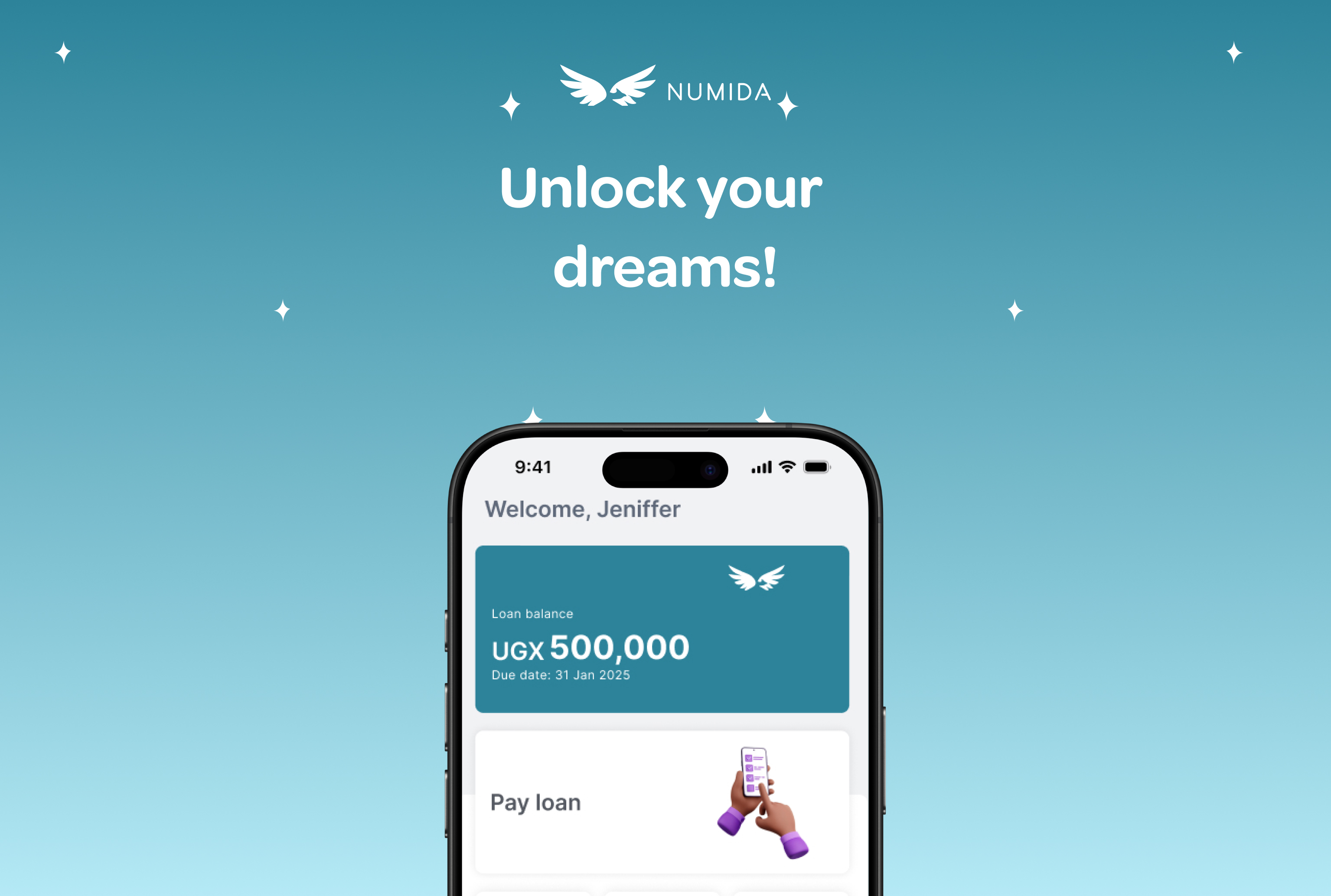
A redesign of Numida's mobile experience: creating a more welcoming place to start, simplifying the loan application and establishing a scalable design foundation for what came next.
THE CHALLENGE · 01
The previous experience pushed customers straight towards applying for a loan, before they had a chance to understand what Numida offered. The interface was outdated, difficult to scale and crowded with information competing for attention. The loan application itself also asked customers to complete a lengthy series of steps.
We wanted to make the experience easier to understand and give customers more confidence in using the app. Just as importantly, Numida was moving towards becoming a financial partner for small businesses, with products and features beyond credit.
The experience needed to make room for savings and future financial products.
The old interface made it harder to find the next useful action.
The visual system and product structure needed to support future development.
THE HOMEPAGE · 02
The old homepage gave significant space to a loan estimate graph, repayment details and loan-growth promotions. Some customers found the graph useful, but many did not know how to interpret it. We wanted a clearer hierarchy and a homepage that could support more than borrowing.
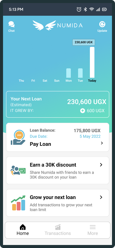
The graph and several promotional and repayment cards competed for attention.
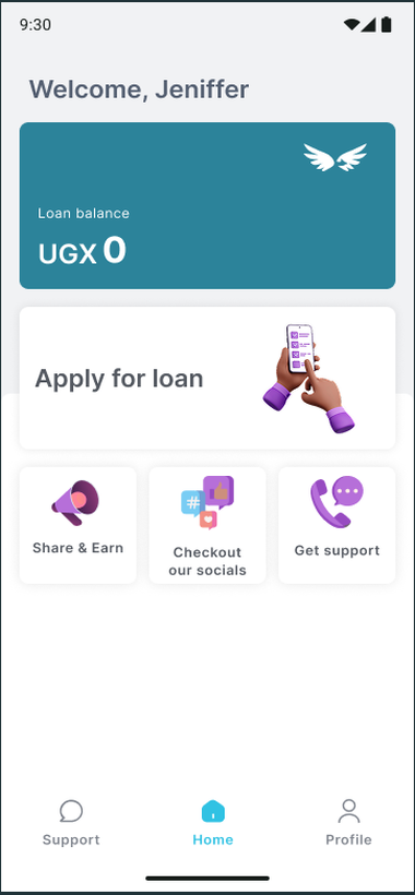
The loan balance and primary action are clear, with supporting shortcuts and simpler navigation.
EXPLORING THE HOMEPAGE · 03
The three homepage wireframes were alternative concepts, not a sequence of iterations. We explored a product switcher, a broader financial overview and a simpler action-led layout. The later visual concepts pushed those directions further. Rather than choosing one concept outright, we combined ideas from across them to create the final direction.
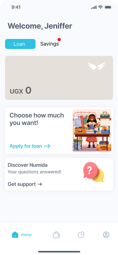
Loan and savings as distinct destinations, with a clear application action.
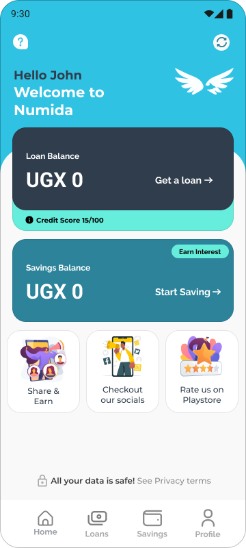
Separate loan and savings balances with supporting product shortcuts.
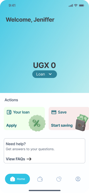
A prominent balance, quick actions and a simpler route to help.
DESIGNING THE APPLICATION · 04
We reviewed the end-to-end application and removed some steps while simplifying others. The work focused on making information requests easier to understand and reducing the effort involved in completing the journey.
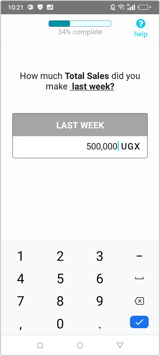
Customers entered sales history through the previous form experience.
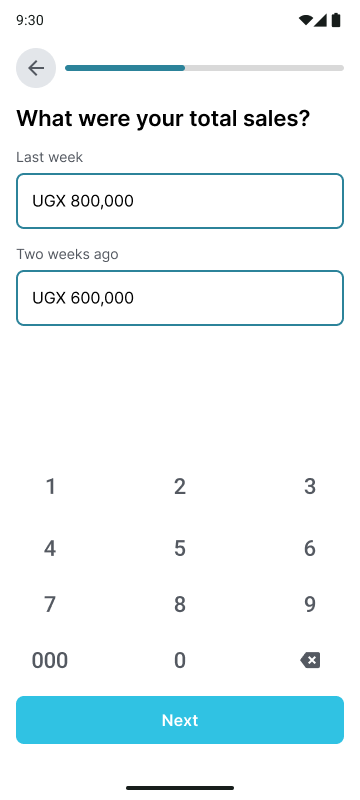
The redesigned screen presents the two sales periods as distinct inputs.
TESTING & ITERATION · 05
Before the final App 3.0 designs were approved, we tested the prototype with existing customers and prospective customers in Kampala. The first round explored three homepage variations alongside the wider application and login experience. We wanted to understand whether people could make sense of the new product structure, where they expected to tap, and what might stop them from completing an application.
There wasn't one clear winner. People wanted a homepage that was both eye-catching and easy to understand. Participants explored from the top down when Loans and Savings were presented prominently. One participant preferred the simpler first option; another found the third option eye-catching and organised, while a different participant felt the second option had too much going on. These different reactions reinforced the decision to combine useful elements from the concepts rather than select one wholesale.
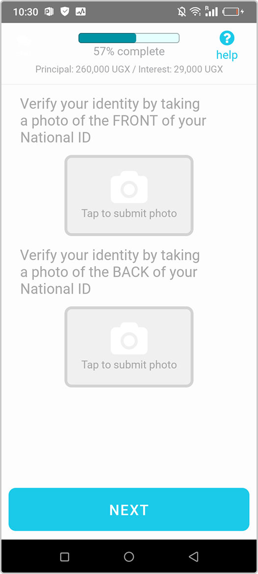
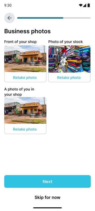
People often assumed every listed document was required. Some overlooked the skip message because their attention went straight to the main action buttons. One participant said they might give up if they didn't have a trading licence or signpost.
People questioned what “total sales” meant and found “week before last week” difficult to interpret. The next-of-kin section also felt like too much information to some participants.
Some participants tried swiping through the onboarding slides rather than tapping Next. Others were keen to read the information, but felt there was too much copy.
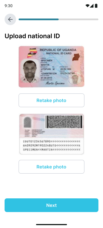
The first round also showed that the application was generally understandable. One existing customer said the new flow was easier to follow than the previous process, where he had needed help from another Numida customer. Others moved through the application without major difficulty, although the photo instructions and optional-document messaging needed more work.
We returned to the field with a refined version on 30 January 2025. The second round involved 12 participants across two groups: six non-customers in Nakawa, and a group in Wandegeya and Ntinda made up of two existing customers and four non-customers. The prototype was already close to the final UI, and the sessions helped us catch remaining points of confusion before approval.
Participants again interpreted the optional photos as compulsory, even when the interface described them as optional. Some were unsure what counted as total sales, how to enter business type, or how to photograph the corners of a national ID. A few expected to swipe through onboarding screens, and several felt the next-of-kin form asked for too much information. We also saw that some customers tapped the balance card when asked to apply for a loan, which highlighted the importance of making the primary action unmistakable.
Not every comment led to a change in the product. The sessions also surfaced wider questions and feedback about loan terms, repayment, payments and customer support. For this case study, I'm focusing on the findings that directly informed the App 3.0 experience.
We made the Continue CTA active so customers could move forward even if they didn't have the optional documents.
We optimised the next-of-kin section so it felt shorter and less overwhelming.
We reduced the onboarding copy while retaining the information customers needed to understand Numida.
The second-round prototype was already close to the final design. These refinements were incorporated before we moved into the final UI.
SECURITY & ACCOUNT CONFIDENCE · 06
Security was a core part of the redesign. Numida is a financial app, and fraud cases on the old version had resulted in customers losing money. We needed a clearer way to help customers protect access to their accounts.
We initially explored offering both PIN and fingerprint authentication. Customer reactions were mixed: some preferred fingerprint because it felt quick and familiar on their phones, while others preferred a PIN because it was familiar from other financial products. Some customers did not use a phone lock at all, and others said they struggled to remember PINs.
As we moved closer to launch, we observed drop-offs at the fingerprint setup stage. The issue was not simply preference: some customers did not know how to set up or use fingerprint authentication on their devices. That knowledge gap added friction at the point where we wanted account creation to feel straightforward. We therefore removed fingerprint from the final flow and retained PIN authentication.
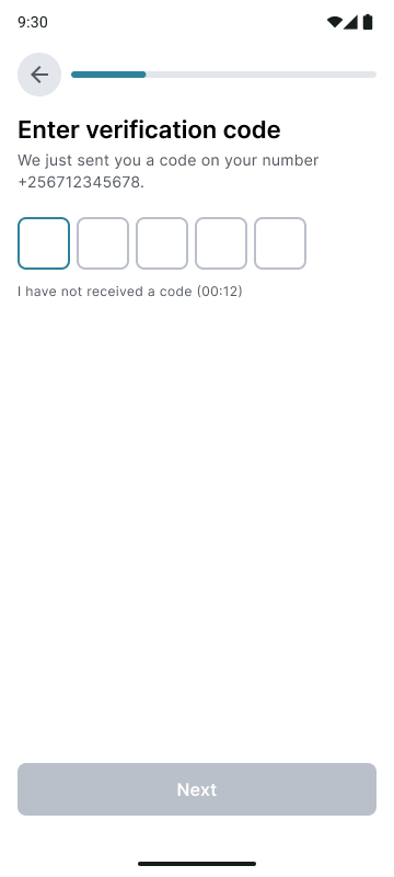
Customers verified their phone number before setting up account access.
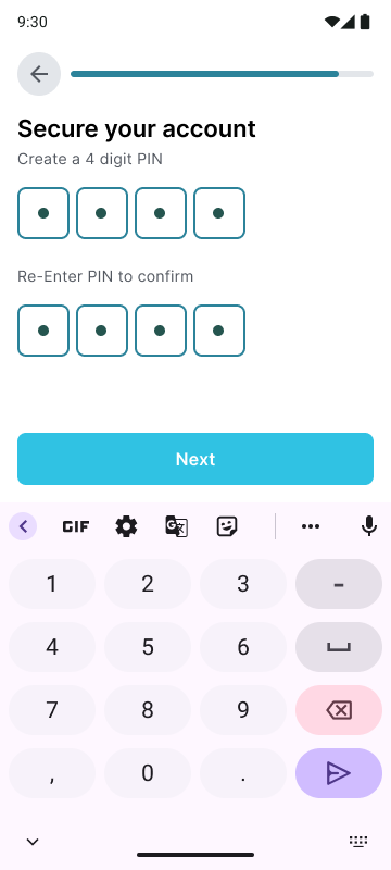
A familiar, consistent authentication step became the final approach after we removed fingerprint setup.
The final account setup kept phone verification and PIN creation as distinct steps, with different screen treatments to help customers understand what each code was for.
BUILDING THE FOUNDATION · 07
App 3.0 had no existing design system, so we started from scratch. With a restricted timeline, we designed the product and established the system in parallel, then continued refining the foundations as the app took shape.
We explored a new visual language for Numida: a broader colour palette, clearer typography, new illustrations and more considered ways to organise the app. We wanted the interface to feel lively and approachable, while keeping the information simple and easy to read.
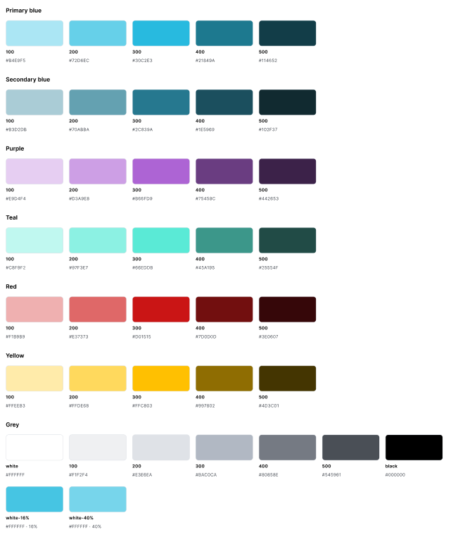
We defined primary and secondary blues, purple, teal, red, yellow and neutral greys, with numbered colour scales. Purple and teal helped broaden the visual language beyond the earlier blue-heavy interface.
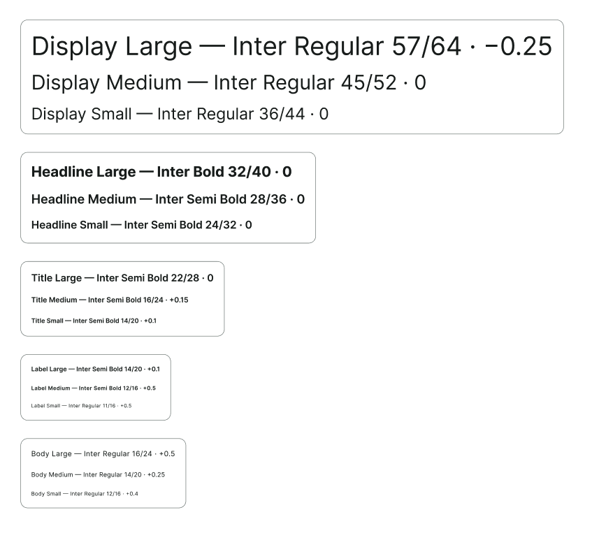
We established a type scale using Inter, from display and headline styles through titles, labels and body text. The aim was to make information easier to scan and comfortable to read across the app.
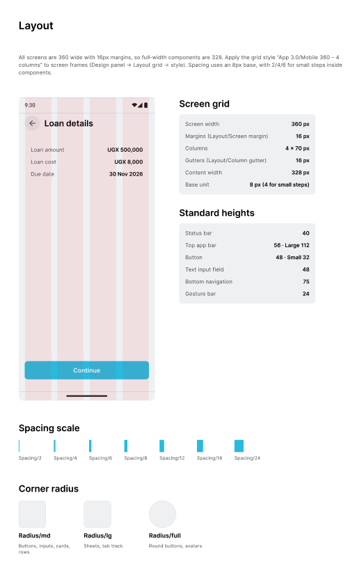
We documented the 360px screen grid, 16px margins, column gutters, standard component heights, an 8px spacing base and corner-radius rules. This gave the team shared layout decisions instead of relying on one-off measurements.
One of my key learnings was how design tokens support the handover between design and engineering. Instead of passing isolated colour values from screen to screen, we could use named, reusable values for things like colour and spacing. That helped create a shared reference for developers and reduced the risk of inconsistencies, such as slightly different blues appearing in the shipped app.
The system wasn't a separate deliverable that we completed before designing. It evolved alongside App 3.0, and we refined it as we applied the foundations to real screens and worked through implementation.
A LIVELIER VISUAL LANGUAGE
We also explored a refreshed set of 3D-style illustrations for everyday actions. The intention was to make the experience feel warmer and more engaging, while giving useful features a more recognisable visual presence.



OUTCOMES · 08
The post-launch review compared the previous performance figures with the latest available app and loan metrics. App engagement increased, while monthly loan volume and customer retention moved differently across markets.
Active users per month
Sessions per user
| Metric | Before | After | Change |
|---|---|---|---|
| Loans per month | |||
| Total loans / month | 16,738 | 14,534 | −13% |
| Uganda | 13,119 | 12,559 | −4% |
| Kenya | 3,619 | 1,552 | −57% |
| Rwanda | — | 423 | New |
| 12-month retention | |||
| Uganda | 18.48% | 24.4% | +5.9 pts |
| Kenya | 27.19% | 11.8% | −15.4 pts |
| Metric | Before | After | Change |
|---|---|---|---|
| Active users / month | 100,000 | ~153,000 | +53% |
| Sessions per user | 2.3 | ~4.0 | +74% |
| Session length | 2.19 min | ~4.7 min | +2.5 min |
Kenya's loan volume and 12-month retention fell substantially in this comparison. These changes may be associated with internal changes that took place during the period; the available figures do not isolate the effect of the app redesign.
12-month retention: Uganda is up 5.9 points and Kenya is down 15.4 points.
Approved loans: down 13% overall. Uganda is down 4%, Kenya down 57%, and Rwanda is new.
The retention figures count customers from the March–May 2025 first-loan cohort who borrowed again 11–12 months later. The Spring 2026 active-user figure also includes a Rwanda launch spike of approximately 35,000 users in March, so it should not be read as growth from the redesign alone.
REFLECTION
App 3.0 was an opportunity to move beyond a loan-first experience. By giving customers a clearer place to start, making the application easier to understand and building a reusable design foundation, we created more room for Numida's wider product ambitions.